How to Graph Data in a Line Graph
1. Always give your graph a title in the following form: "The dependence of (your responding variable) on (your manipulated variable).
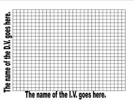
2. The x-axis of a graph is always your manipulated (independent) variable and the y-axis is the responding (dependent) variable.
3. Always label the x and y axes and give units.
4. Decide what type of graph is needed. If the manipulated variable is a category, such as colors, or distinguished groups, the graph will be a bar graph. If the manipulated variable is a continuous number such as age or time, the graph will be a line graph.
5. Plot your data. In a line graph, connect the plotted points, and circle the data points.
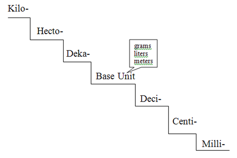
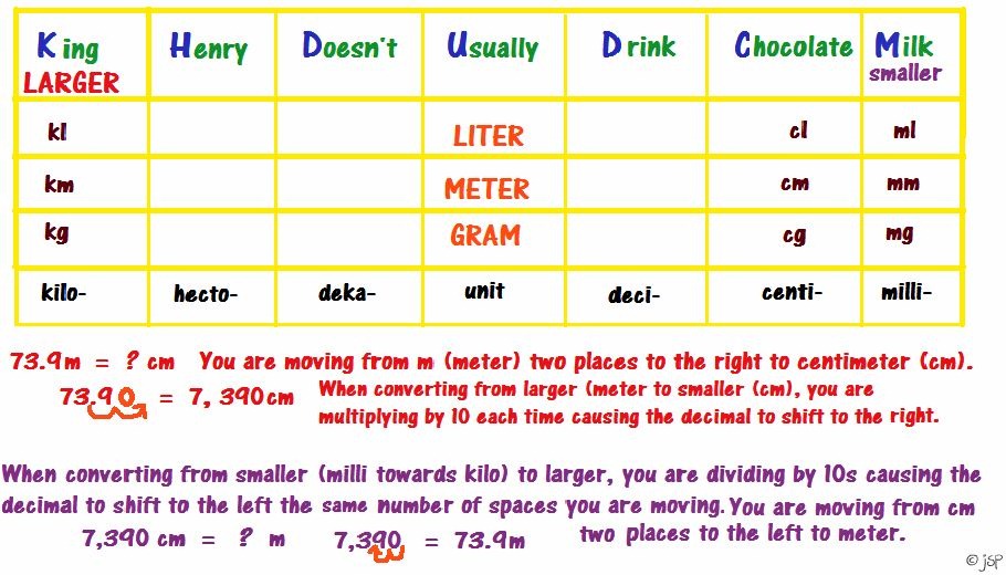
Metric Conversions
Lab Safety
Being Safe in the Lab is our first priority when we are working with various equipment, materials, chemicals, and instruments.


|


|
